Brand Identity & Strategy for a Mindset Coach for Creators
PROJECT: BRAND IDENTITY & STRATEGY
OVERVIEW:
Nathan is in the process of starting a mindset coaching business focused on artists and creators of all kinds. He has a marketing background and already had an amazing start on his branding efforts. He was simply looking for some guidance and feedback on what he’s created so he could develop a really strong brand identity.
Nathan had already identified the different brand archetypes:
The Sage for the overall business
The Magician for himself as the teacher/mentor
The Creator for her target market
He also already had his logo created, fonts, and some brand colors picked out that he really liked. So we just needed to find a way to tie each of these together to speak directly to his target market while conveying himself and the brand as a transformative teacher.
Here’s a look at what we came up with for the brand strategy and how we came up with it:
Understanding the target market
The first thing I wanted to do with Nathan was identify his target market’s deepest desire: What truly makes them tick as creators. Knowing this will help us identify the feelings we want to touch on throughout the brand.
After discussing this at length, we identified that Nathan’s target market truly and deeply identify as creators. They have a burning desire to bring something to life through their creativity. It’s what fulfills them as humans. It is simply who they are.
While these people don’t necessarily have a desire to create a full blown career from their creative endeavors, they do have a need to continue to create since it is such a deep part of their identity.
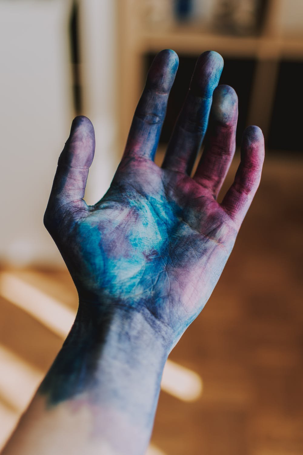
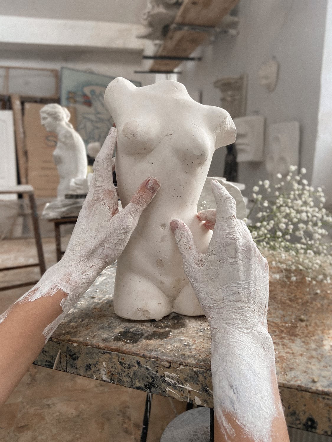
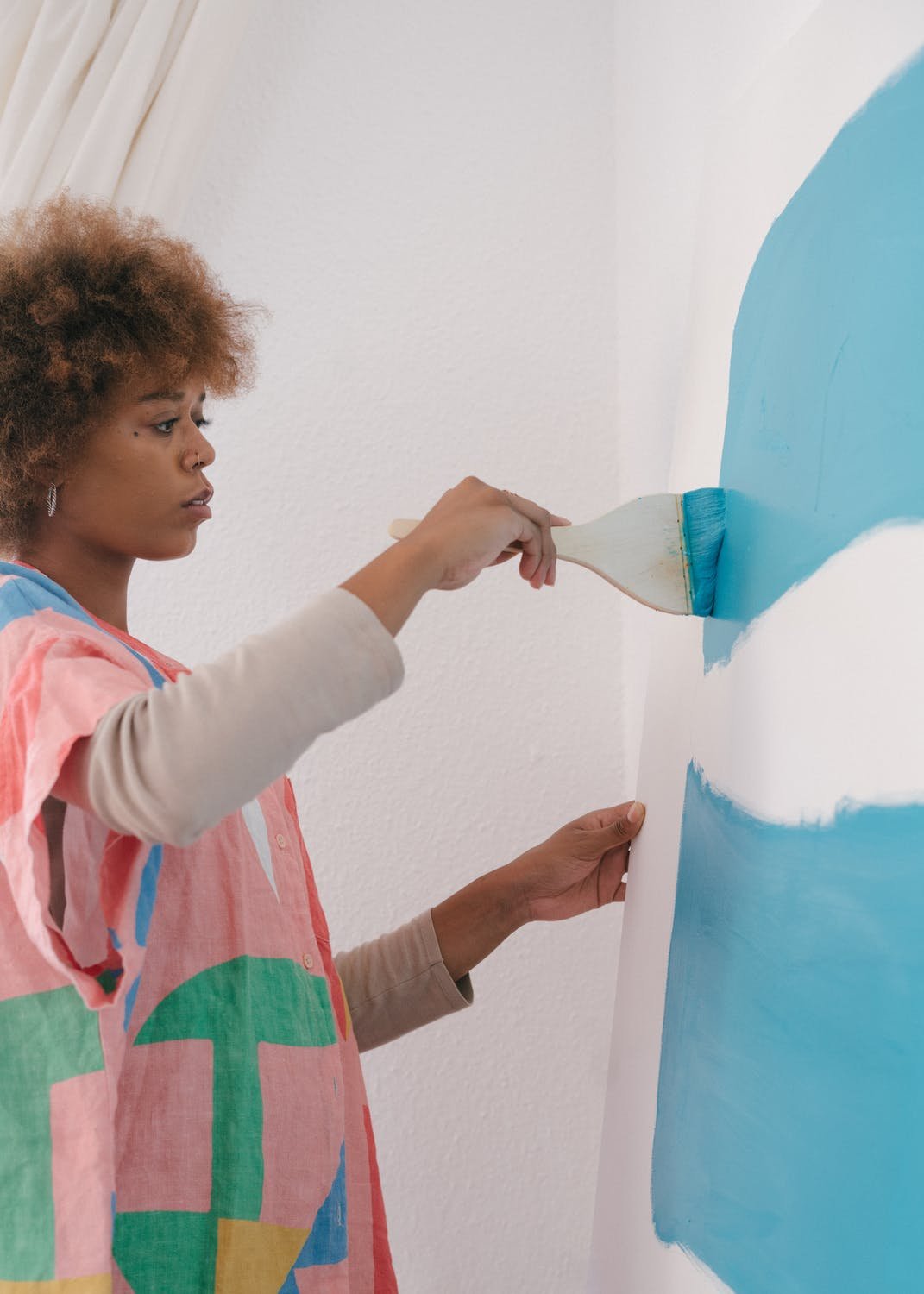
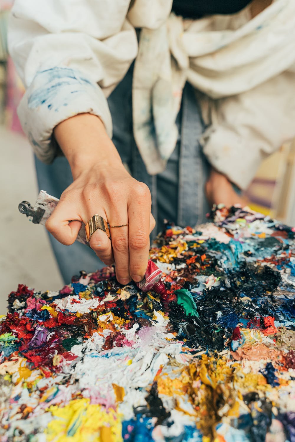
Brand imagery
With the above in mind, I started choosing imagery to illustrate the feeling creators have while creating whatever art form is their chosen medium. While my focus was heavily on evoking those emotions, I also chose photos that touched on the chosen color palette to tie all the different brand elements together.


Brand patterns and elements
I also chose some gradient patterns that we could use as an overlay for his graphics like the covers for his different product offerings. When choosing these, I focused on 2 things:
Movement: This is central to any creative process and is also symbolic of the transformation they will go through in Nathan’s programs.
Magic: This touches on Nathan as The Magician Archetype helping students through a complete transformation as creators.
I also wanted these to be within the chosen color palette to keep everything consistent.


Color palette
While Nathan had already identified the colors we wanted to use, I helped him identify how to best use the various colors in his color palette. I pulled out 3 primary colors and kept the rest as secondary colors. This will help give focus on how to best use the colors throughout the website and other marketing elements.
Product covers
And last but not least, I put it all together to give him an idea on how the product covers could look for his various offerings. I used the gradient patterns as an overlay on some of the chosen imagery and pulled out some of the icon-style elements of his logo to use to help quickly differentiate each product from each other.
HERE’S A LOOK AT HOW IT ALL CAME TOGETHER WITH HIS MOODBOARD:

“I just wanted to thank you for your focus, energy and expertise in helping me with Open Creative. I’m very confident in the branding approach you created and I am very grateful for the consulting and guidance you have given me.”