
User Experience (UX) Website Audit for a Stationery Designer + Educator
PROJECT: CUSTOM UX WEBSITE AUDIT
OVERVIEW:
Laney and I connected in a Facebook Group after she posted about needing some help getting her website organized. She’s both a wedding stationery designer and an educator for other stationery designers so making sure the website was user friendly and easy to navigate was essential.
While she’ll still be offering stationery design for couples, she wanted the focus of the website to be mainly on her education offering. She has 2 courses and a membership that she wanted the focus to be on but also has a ton of other smaller business resources (free + paid) that business owners can purchase that were currently scattered around her website.
The main goal was to streamline the website for easier navigation and improve the overall user experience to increase conversions for key offerings. To do this, we wanted to focus on creating a user experience that drives traffic to the 4 main offers on the site - the 2 courses, the membership, and the business resources.
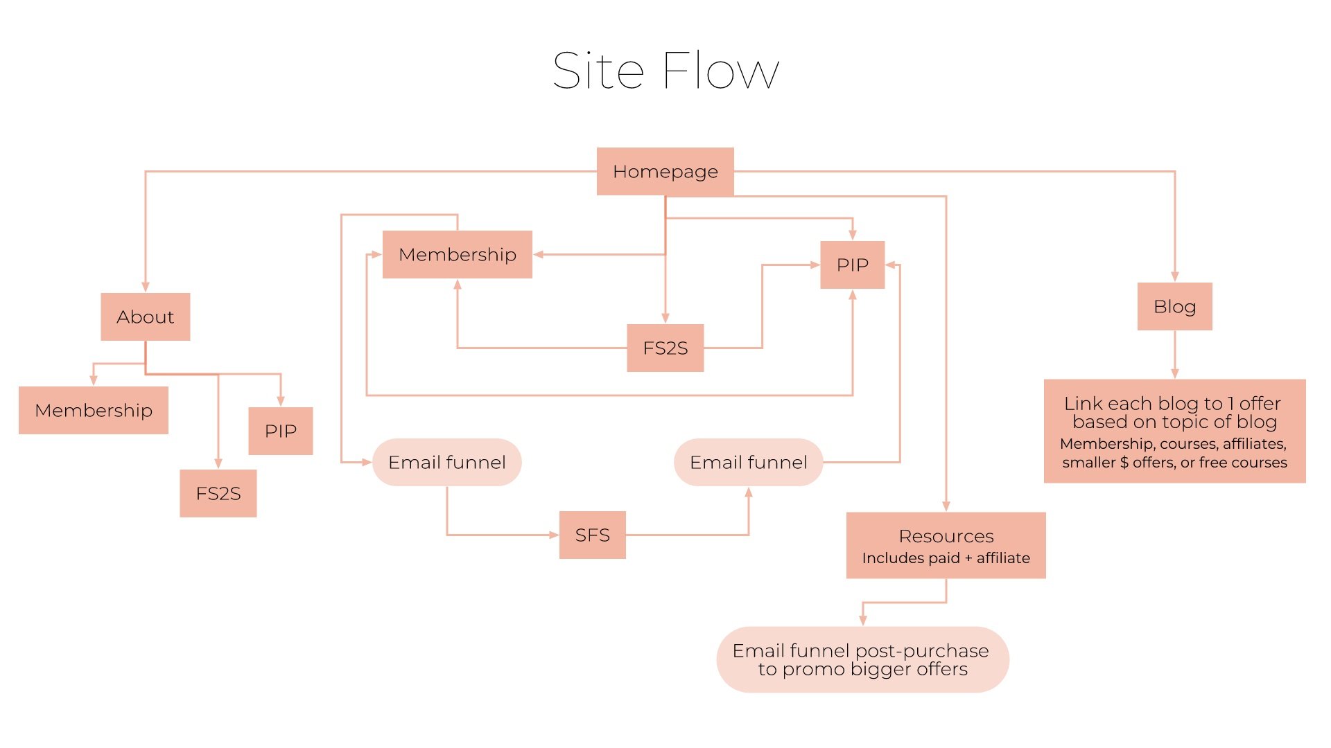
HERE’S A LOOK AT THE PROPOSED SITE NAVIGATION:

This helped give us a good idea on the main pages for the website so we could then determine the best overall website flow based on the different customer journeys Laney provided me with.
You’ll notice there is one more offering on the below flow chart. This isn’t a main focus for Laney at the moment but an offer that would potentially be an upsell/next step for her students looking for more as they grow. For that reason, I included it on the site flow but included that it would be promoted via an email funnel instead of being a main focus/in the main navigation on the site. Once built, it will be easy enough to move to the navigation if wanted in the future.
HERE’S A LOOK AT THE IDEAL SITE FLOW/CUSTOMER JOURNEY THROUGH THE WEBSITE:
Once I nailed the overall user experience, it was time to move on to create some really basic wireframes and suggested copy for each page that Laney could take to her designer to implement on her current website.
HERE’S A LOOK AT SOME OF THE WIREFRAMES:


I actually really liked the current layout and design of her membership sales page so I suggested she use that as a template/wireframe for the 2 course sales pages.
Overall pairing the wireframes and suggested copy together in this website audit helps give a really clear picture on how the website should come together structurally. That way Laney’s designer can use this as a guide to then make everything look amazing while keeping the ideal UX structure in place. I can’t wait to see how her website transforms with this information!