
Brand Strategy for a Regional Government Agency
PROJECT: BRAND STRATEGY
Inclusions:
Renaming
Brand Strategy
Communications Strategy
Launch Strategy
OVERVIEW:
*This project was in partnership with Carrboro Creative.
I was brought in as a brand strategy partner by Carrboro Creative to assist with the strategy behind the rebranding for a local, regional government agency as well as their communication strategy and launch strategy.
The agency has gone by Triangle J Council of Governments for years but they felt the name didn’t necessarily represent their region or the work that they do so it was time for a new name and strategy around that name to truly represents their region and organization as a whole.
For context: There are various councils of governments (COG) for different regions in North Carolina. Each COG as a letter associated with the a region they represent which is where the J in their name came into play. Our region is also typically called The Triangle (Raleigh - Durham - Chapel Hill) but they actually represent towns and counties outside of what would be considered The Triangle so they didn’t want that much emphasis on the Triangle. So here’s what we had to consider for renaming:
The J in their name was confusing since most people don’t know what that represents
They represent towns and counties outside of the Triangle and wanted to deemphasis that in their name
The region is a mix of rural and urban so they don’t want any members to feel like they aren’t represented well
They are the largest COG in North Carolina
Their peers that are best in class throughout the country as transitioning from council of governments to regional council
These were the biggest factors for us to consider when coming up with new brand names.
HERE’S A LOOK AT SOME OF THE OVERALL BRAND STRATEGY:
Renaming
Keeping all the factors presented to us in mind and comparing names with the other COGS in the area, we played with a lot of options that are specific to North Carolina but we ultimately knew we wanted to have a name that signified the geographic location within North Carolina and help solidify their position as the largest COG in the state.
Because of this we landed on Central Pines Regional Council.
Central because their region is centrally located within the state and pine because pine trees are the state tree. Pine trees are the state tree for a few reasons:
We have a ton of them in the area primarily because their ability to adapt to our diverse soil conditions. We have sand, clay, and more traditional soil… Pines thrive in all 3.
They were also previously used in the production of tar back in the 1800s which is why we are the Tar Heel State and now pine is primarily used in construction.
Between these 2 reasons, it was the perfect symbolism. The organization wants to bring the gap between rural and urban and the past and present representation of the pine is a poetic representation of this. Not to mention the organization quickly adapts to their members needs which just another little poetic cherry on top making this the perfect name for them to change to.
Brand + Communication Strategy
Along with their current name not representing their organization, they didn’t feel like their current strategy helped illustrate how they help their members so we also included a brand and communication strategy as well to really tie all the pieces nicely together.
Inclusions:
Brand values and voice
Brand persona: A trusted source of practical information and analysis. The trusted resource engages and connects through knowledge and common interests or facts. This helps guide, teach, and lead others to make rational decisions while also providing the resources to assist with those decisions.
Brand purpose/one liner + extended version to describe their organization in a succinct but effective manner
Unique value proposition and market positioning
Key messaging with a guide on how to utilize and bring together their various focus areas to illustrate how they’re all intertwined
Launch Strategy
And last but not least, we put together a launch strategy so they can effectively introduce their new name and branding. This included a comprehensive spreadsheet for each phase of launch including pre-launch, launch, and post-launch.
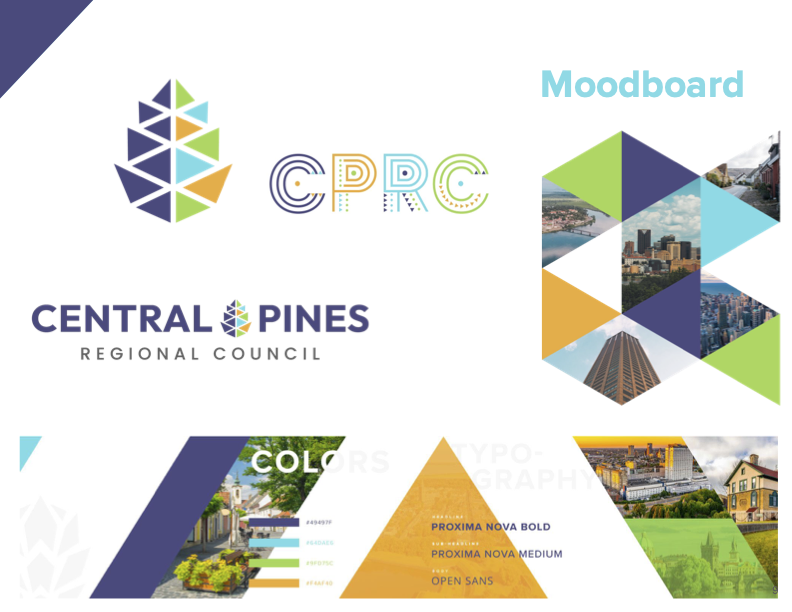
HERE’S A LOOK AT THE FINAL REBRAND:
Carrboro Creative’s team did an amazing job with the design of the branding. It truly captured the organization’s new direction!
“Thank you again for joining us for our event last night. I am so happy with how things went. You all did a great job presenting and communicating the excitement of the brand.
Your focus on rural-urban, inclusivity, and the history of {previous brand name} captivated our elected officials and, I think, sealed the deal.”